

Church on The Ave Overview:
A church in the heart of University District near University of Washington. They seek to tell people about Jesus, while honoring the rich history of the neighborhood they are located in. They host the longest serving seattle soup kitchen. As the church has celebrated 5 years, they decided they wanted to look a little more established online, a more defined brand and style, as well as a more fleshed out website with information that people are usually looking for when visiting .a church website.
Information Architecture Document
Style Guide with intentionally chosen colors, fonts, logos for future posters and graphics.
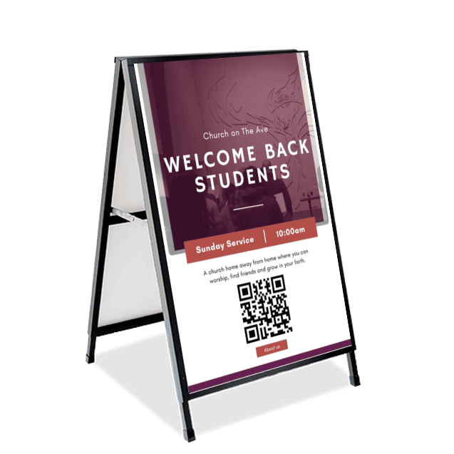
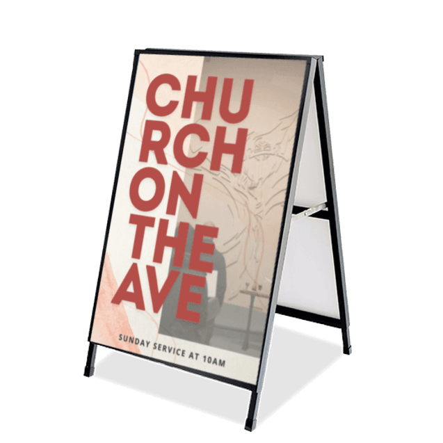
Poster Designs for welcoming students back to campus and into church
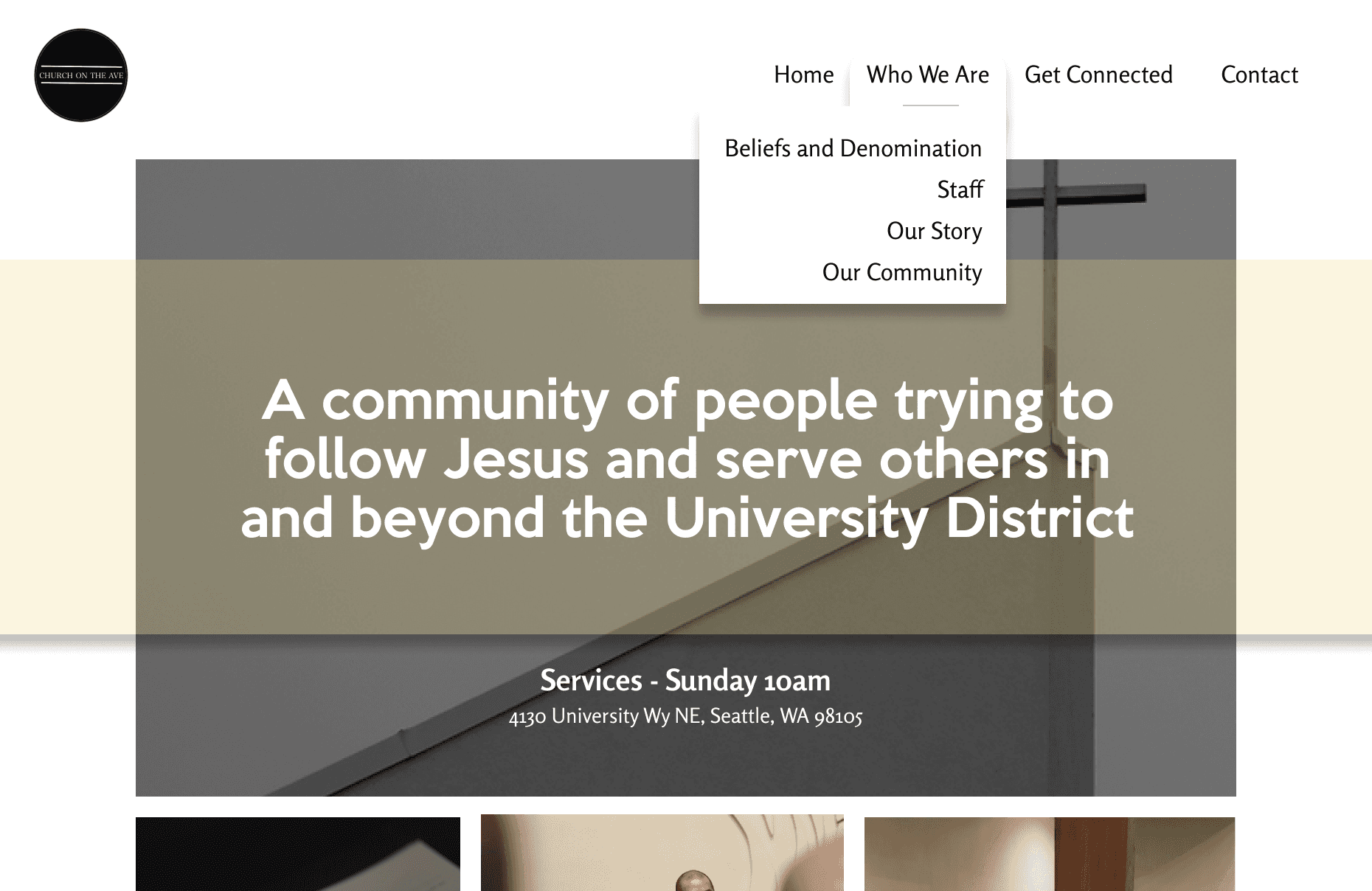
Revamped Website - streamlined information
Updated and Relevant Photos
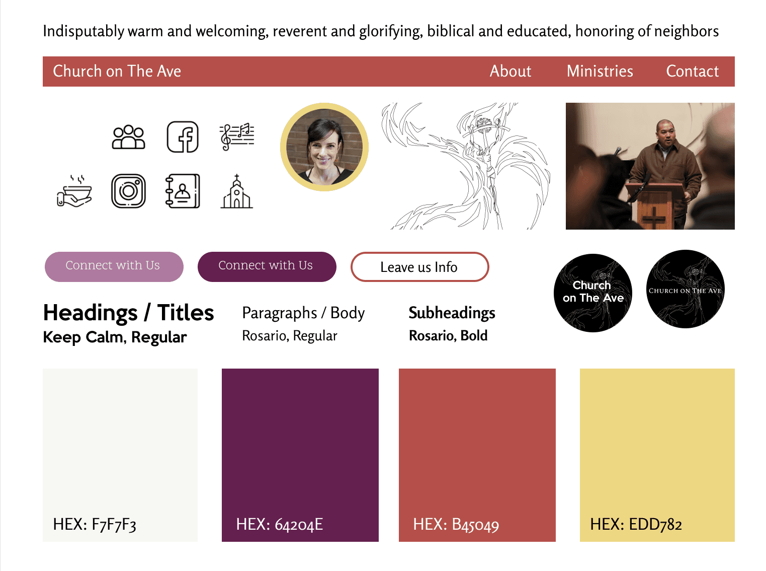
About: Style Guide
I love representing the values and character of a community, working hard to understand the community first before attempting to execute style for them.
Colors: Being so close to University of Washington is important to CoTA’s mission in Seattle, so I wanted their school colors to be subtly incorporated into the websites design. Scripture is a value for CoTA, and these colors also have strong biblical meaning, purple indicating royalty and authority and often the color of the Lent season. The addition of the yellow and red colors create a very warm, welcoming color palette, which the pastors and I felt encapsulated CoTA's community.
Typefaces: CoTA incorporates a lot of traditional liturgy and sacraments in their services, music and values. I hoped to showcase this characteristic with a serif font. In contrast, it is a younger church, in demographic and age, so I looked at more modern serif fonts. However, I struggled to maintain professionalism with such a casual serif font. In the end, I went with a subdued, traditional-looking sans serif font (Rosario) for body text and a bold, modern, but still clean and simple title font (Keep Calm). I think the two typefaces straddle tradition and refinement with youthful and current, while still maintaining professionalism.
Graphics / Buttons / Pictures: I knew the pictures of the church and its congregation would be the most prominent graphics used in websites or physicals. No animated lightning bolts, cutting-edge buttons or sound effects. Church on The Ave is not flashy, but down to earth and so focused on the people that walk through the doors. The one non-photo graphic the pastors requested was their beloved Cruxifiction art piece, a focal point in the church building. My digital trace of such is shown on the style guide and appears liberally through all of CoTA's branding applications.
Maddie Chan